
Path@Penn — Simplifying the Course Registration Process
Role Full Stack Designer
Timeline 2023 (5 weeks)
Skills Product Design, User Research, Prototyping
Current Path@Penn Landing Page and Course Registeration
01 Overview
Path@Penn is a student portal at the University of Pennsylvania. The University Registrar has noticed an increase in help desk requests resulting from students’ inability to find information and complete tasks related to course registration. Project goal was to redesign the landing page and the course registration process of Path@Penn to better meet user needs, increase usability, and decrease help desk requests.
02 Research
I began my research process by conducting a usability audit referencing the 10 Usability Heuristics for User Interface Design. This exercise helped me identify key usability issues and inform my design decisions.
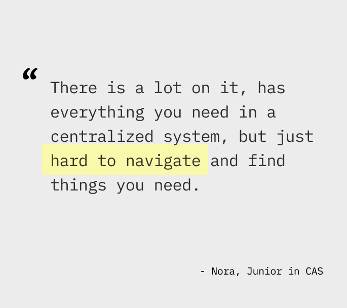
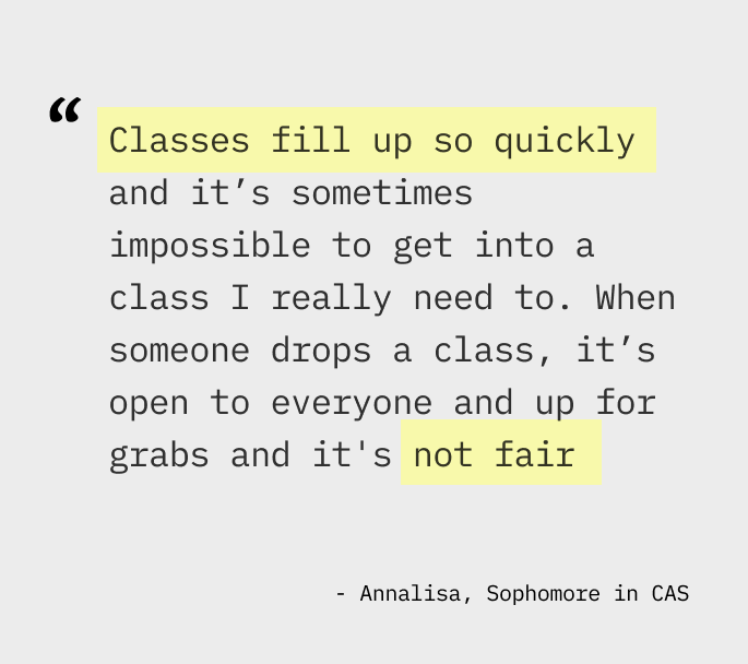
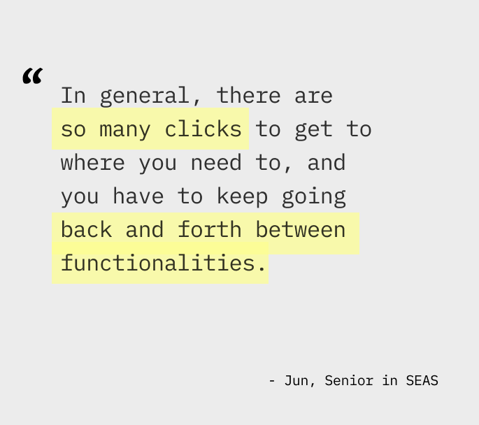
To further identify pain points, I conducted user interviews with 5 current Penn students with varying levels of experience with Path@Penn.
03 Synthesis
After synthesizing insights from user interviews and the usability audit, I identified these recurring themes.
- Inefficient Navigation. Building and adjusting a course schedule requires a lot of switching between tabs and/or split screens due to information being on different pages of the website or only available on external sites, which causes unnecessary friction.
- Vague System Language. System language is unclear which causes confusion. Specifically, there were multiple buttons for completing registration for courses named “save changes,” “add to cart,” “submit schedule,” and “submit registration.” Because they equally make the courses appear in the schedule tab, students reported being confused whether or not their submission fully went through.
- Visual Clutter for Landing Page. Unused or underused functionalities clutter the landing page.
- Uncertainty. Lack of internal waitlist system induces anxiety for popular courses.
With these main insights, I focused on the following opportunities.
- How might we make navigation more hassle-free?
- How might we make the interface customizable to cater to each individual’s needs?
- How might we integrate a waitlist system to deliver a more reliable experience when students register for popular courses?
04 Ideation
Iteration #1 — Adding visual aid with icons
The landing page mostly featured long hyperlinks, which made items hard to locate. First iteration of redesign was a more minimalistic layout with large icons to provide visual aid. From user testing, students reported the icons made the landing page less overwhelming and easy to navigate. However, it still did not solve the problem of constantly switching between tabs.
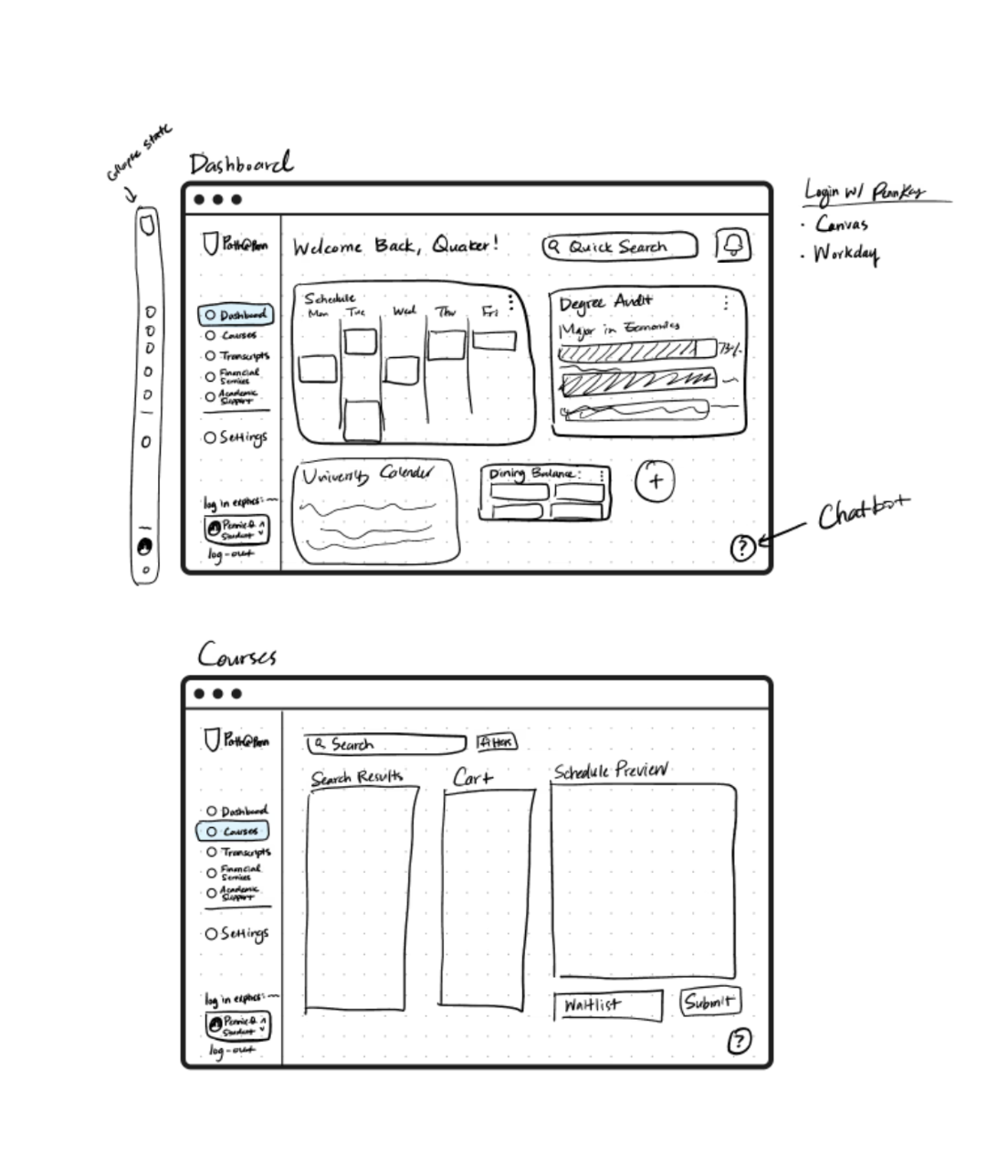
Iteration #2 — At-a-glance dashboard design
I chose to explore a dashboard design featuring customizable widgets, allowing users to access key information at a glance. This approach minimizes visual clutter and eliminates the need to navigate through multiple tabs.
05 Final Prototype
Interactive Prototype Link
Collapsible Side Nav bar. Reduces visual clutter of the original hamburger menu with long texts
Customizable dashboard. Reduces time searching by allowing users to keep only the features they use most often.
Quick Links & Actions. Shortcuts on the dashboard as icons.
Single-tab course registration. Based on user insights, students reported having a separate windows, one for course registration on Path@Penn and the other for course ratings to refer to. Having Reduces switching of tabs by providing immediate visual feedback for added courses in the calendar view. Clarifies language use by having one "submit" button. Removed distracting animations.
Getting on the waitlist. Currently, students rely on "Penn Course Alert," a third-party tool that sends SMS notifications when a course seat opens. This creates a high-stress environment where students must race to register the second they receive a text, often missing the window if they aren't instantly available. To eliminate this uncertainty, I designed an integrated waitlist system. Allowing students to queue for a spot directly within the registration platform removed the need for external monitoring and replace the stressful speed-based competition with a fair, automated enrollment process.
Getting off the waitlist. Once students are on the waitlist, they can check the status and register right away from the same page.
06 Takeaways
User research and feedback is important because it challenges personal bias & assumptions. This project was challenging because I was also one of the users. Conducting usability testing and listening to other’s feedback revealed insights I had not initially thought of.
Simplicity shouldn’t be at the expense of inclusivity. Some found the “underutilized” features (advanced search and landing page hyperlinks) useful. We should be careful when making decisions on whether to keep or remove features.
